AHC 621 - Prototype Analysis
Procedure
We tested 8 participants with the task:
You are an AHCP student who is trying to register for 3 classes, AHC 601, AHC 602, and AHC 603, for Spring 2027.
We recorded how long each participant took to complete the task. Then we had a post evaluation survey to ask the participants about their thoughts. After the survey, we had a short open-ended discussion on the current design.
The survey questions includes:
-
The interface is easy/hard to use.
1 (hard) - 5 (easy) -
The interface is understandable.
1 (disagree) - 5 (agree) -
The registration process is understandable.
1 (disagree) - 5 (agree) -
How fast/slow is the process?
1 (slow) - 5 (fast) -
From 1 to 10, how satisfied are you with the current design?
1 (dissatisfied) - 10 (satisfied) - Do you have any suggestions for improvement?
- Do you have any additional feedback?
The first four questions are on a 5-point Likert scale. The fifth question is also a Likert scale but with a range of 10 points. The last two questions are open-ended, the participants could either type or sign their answers.
Results
Test Observations
All participants were able to successfully complete their task. Most participants provided positive comments on the design during the testing process. However, the biggest problem in the test was not realizing that they successfully registered the courses. Almost all participants struggled with recognizing that they successfully registered the courses. One participant tried to find the class that was conflicting with AHC 602, but it was not in the prototype. One participant spent some time on the homepage trying to find a way to the class finder page.
Time
The participants took on average 2 minutes to complete our task. The lowest time was 1 minute and 20 seconds, and the highest time was 2 minutes and 25 seconds.
Survey Results
The participants found the interface is mostly easy to use with an average of 4 and median of 4. The participants also found the interface to be mostly understandable with an average of 4.25 and a median of 4.5. The registration process was rated as somewhat understandable with an average of 3.75 and a median of 4. Participants viewed the registration process as somewhere in between fast and slow. The average is 3.5, and the median is 3.5. The participants' design satisfaction rating has an average of 6.75 and a median of 6.5.
Feedback
All participants had an overall positive opinion on our current design, but they recognized that it still needs improvement. One participant said, “Over all the app is good.” Another said, “I like that I can clearly see important information [on the homepage] in one place” (paraphrased quote). Some participants commented that they like that they don't have to jump all over Workday to sign up for classes. Some participants gave suggestions for improvement. The most common feedback was adding color to the website. One participant said, “it is very clear and simple, but I would like to see more color visible that easy for people know where to click next or guide to next step.” Another said, “adding color errors instead of just blue, keep them highlighted so it does not disappear.” Three participants suggested adding some kind of way to keep track of current registered classes, so they can easily scroll through the list and classes and see their registered courses at the same time. One participant suggested a “shopping cart” system to add classes to the cart and register them in one click. One participant suggested linking the class textbook in the course information page. One participant suggested swapping the “yes” and “no” dialog button because they expected “yes” to be on the right, but it was actually on the left. Another participant suggested linking the conflicted class in the conflict resolution dialog box.
Discussion
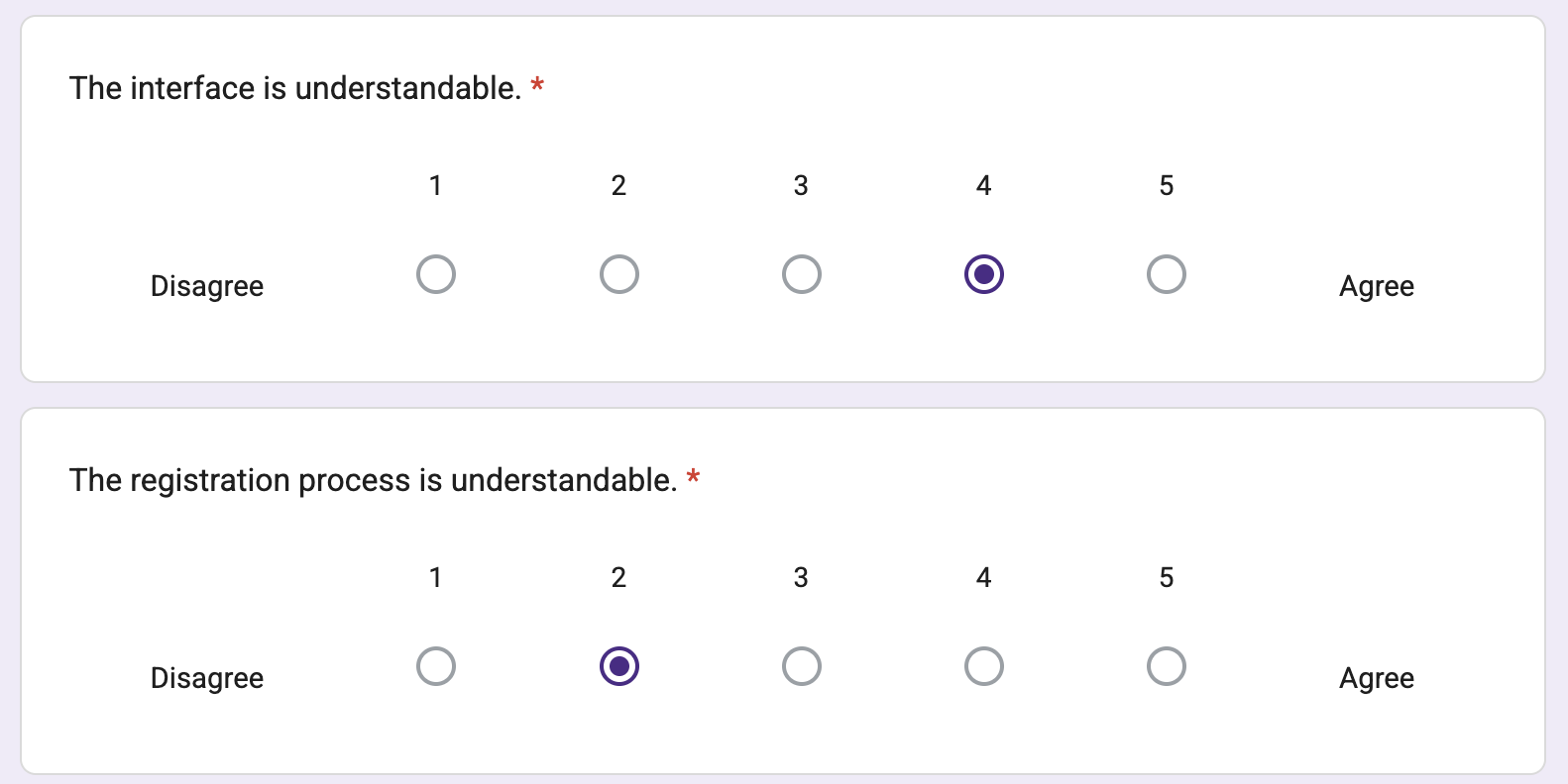
Overall, the participants found our interface mostly easy to understand and use. However, the average understandability of the registration process decreases a little more. The figure below shows the participant marking the registration understandability lower than the interface understandability.
Participants found that the registration was somewhere between fast and slow. During the user test, we discovered that all participants struggled to realize that they successfully completed their task. This suggests that we still need to further refine our redesigned class registration process and more importantly design a better confirmation feedback system. The 6.75 average statisfication rating on our current design shows our design still have a lot to improve. The participants' post-test feedback gives us further insight into what can be improved. The most common feedback was adding color-coding to the webpages. Our current design did not use color-coding for our class information labels. If the labels were color-coded, it would be easier to see which two classes are in conflict at a glance. Some of the feedback are related to efficiency of the registration process such as adding a link to the conflicted class, adding a shopping cart system, and linking the textbook information. These ideas help us understand the student's priorities in registering classes: having a quick way to find information relating to classes and a way to see the current state of their registered courses more easily.
Future Actions
Based on the results of our analysis, there are several actions we can take. The most important thing to do is to make a more clear feedback system for the class registration process. Add more color coding to make telling apart different issues easier. Add a feature to show currently registered classes. For class conflicts, add a link to show the conflicting class, so the students can compare and decide which one to choose. Improve the efficiency of finding important information about the class, such as textbooks. Overall, the current design is too simple, and we still need to make our design more fleshed out.